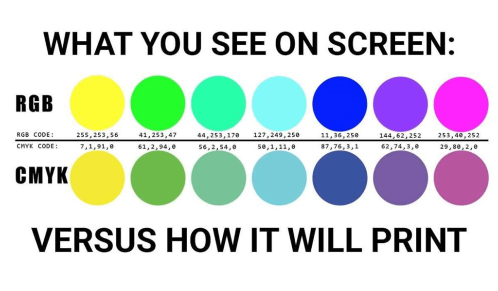
If you’ve ever sent a design to print and been surprised by how dull the blacks looked compared to your screen, you’re not alone. It’s one of the most common print surprises and it comes down to how black is actually built in a CMYK print environment.
When designers talk about “black,” they usually mean one of two things: a simple single-ink black (100% K), or a mixed-ink black often called Rich Black
100% K Black uses only the black ink channel in a CMYK press. It’s clean and efficient and great for small body text, fine lines, or anything where ink overlap could cause registration issues. But on larger areas, it can look flat or slightly gray, especially next to vivid colors.
Rich Black is built by layering multiple ink channels together – typically a combination of Cyan, Magenta, Yellow, and Black – to produce a deeper, denser appearance. A common formula is C: 60, M: 40, Y: 40, K: 100, though variations exist depending on the press and paper stock. The result is a black that looks noticeably richer and more saturated in large fills, backgrounds, and bold display text.
Your monitor emits light, creating color additively, by combining red, green, and blue light. Printing, on the other hand, works subtractively: inks absorb certain wavelengths of light and reflect others. The deep, almost luminous black you see on a backlit screen simply cannot be replicated with a single ink on paper. Rich Black is the closest approximation that offset and digital printing can achieve.
Using Rich Black on small text can cause a blurry or “shadowed” effect if the ink layers shift even slightly during printing, a phenomenon called misregistration. Keep small text clean with 100% K only.
Always check your black values before exporting your final files. If you’re designing for large-format or full-color commercial printing, ask your print provider for their recommended Rich Black formula as it can vary by press type and substrate. When in doubt, design in Rich Black for visual elements and switch to 100% K for any text below 14pt.