Picture this: a potential customer walks past your trade show booth. Your retractable banner has your logo in navy blue. Your staff shirts show something closer to royal blue. The brochures on the table use one font, and the business cards use a slightly different one. Nothing is technically wrong, but something feels off. And that feeling, even if they cannot name it, is doing quiet damage to your credibility.
Brand consistency is not about being rigid. It is about making sure that every time someone encounters your business, they get the same impression. When your colors, fonts, and tone line up across signage, apparel, and print materials, your business looks established and trustworthy. When they do not, it looks like different departments are running different companies under the same name.
This happens more often than most business owners realize, and almost always for the same reason: materials were ordered at different times, from different vendors, without a master reference anyone was actually checking.
Start With a Brand Standards Document
Before you can check anything, you need something to check against. At minimum, document your exact colors in every format you need: Pantone for print, CMYK for offset and digital, RGB and HEX for digital use. These are not interchangeable, and a printer working from the wrong color mode will get different results than you expected.
Also document your approved fonts, your logo in all its versions (full color, single color, reversed), and clear rules for spacing and placement. A good designer can put this together as a single reference sheet your vendors can actually follow.
Signage
Wide format signage is often where inconsistencies are most visible. Colors print differently on different materials, so what looks correct on coated paper may look washed out on a mesh banner. Always ask for a proof before committing to a full run, and review it against a printed color reference rather than your laptop screen.
Also think about viewing distance. Elements that seem oversized in your file often look exactly right at twenty feet. And if you have multiple pieces at the same event, a banner, a feather flag, a backdrop, they should look like they belong to the same campaign.
Apparel
Branded apparel adds complexity because you are no longer printing on paper. Embroidery, screen printing, and heat transfer all handle color and detail differently.
Embroidery has limits. Fine lines and small text do not translate well into thread, so you may need a simplified version of your logo for garments. For screen printing, colors are mixed as inks and can be matched to your Pantone reference, but only if you ask. If you just send a file, the shop may default to the closest standard ink in their inventory.
Also decide on placement standards in advance: logo on the left chest only, a specific maximum size, whatever fits your brand. Leaving this up to interpretation across multiple orders is how shirts end up looking like they came from different companies.
Print Materials
Business cards, brochures, postcards, folders: these are often ordered in pieces over time, which is exactly how inconsistencies build up. Put recent orders side by side. Do the blues match? Does the logo look the same weight and color across pieces from different print runs?
Watch your typography carefully too. A lot of brand drift happens when someone needs a quick flyer, cannot find the exact brand font, and substitutes something close. That substitution gets saved as a template and spreads from there.
A Simple Audit
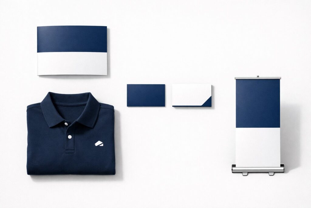
Pull one of everything together and lay it on a table: a business card, a brochure, a shirt or hat, and a photo of your signage. Look at them all at once and ask honestly whether they look like they belong to the same company. If something looks off, find out where the drift happened before you order your next batch.
A lot of brand inconsistency is just the result of ordering from too many places. Each vendor works from whatever file you send them, with their own interpretation, on their own equipment. Working with a single printer who handles signage, apparel, and print materials simplifies things considerably. They already have your files, they have seen your colors, and the conversation starts from an established baseline instead of from scratch every time.
Brand consistency is not a one-time project. It is something you maintain every time you produce something new. The businesses that do it well do not necessarily have bigger budgets. They just pay attention every time, and they work with vendors who help them stay on track.
Print Basics handles offset and digital printing, wide format signage, branded apparel, and promotional items all in one place. Contact us to start your next project.


